Friday, 4 November 2016

DPS article

Steeplechase is a track event in which you require a unique blend of multiple talents. As a steepler, you will need the finishing speed of a sprinter, the stamina of a cross-country runner and the strength and flexibility of a 400m hurdler. Because of the specificity of this event, you need to develop large amounts of strength, skill and flexibility. These skills can be developed in a variety of different ways, from strengthening and conditioning sessions in the gym to develop strength, mobility work to aid your flexibility over time and technical sessions to perfect you barrier hurdling and water-jump technique.

One of the first phases of beginning to learn how to steeplechase, is to learn how to hurdle. This should be done in the speed endurance phase of training over the winter. Technique, volume and rhythm are the key aspects of this phase. Muscle memory drills can be done in relatively high volumes, twice a week at most. These drills should be combined with wall drills and actual hurdling similar to that used by intermediate specialised hurdlers.

Rhythm hurdling is most effective after a long run, an example of this would be to run 4 miles at a moderate pace, and at the end of the run, come on to the track and run a steady 800m with 4 hurdles per lap. This will enable the athlete to feel how they would during a really steeple race. The lactic acid in the athletes legs will show the trueness of their hurdling technique. Intermediate hurdles should be used for this as the athlete will be very fatigued and these hurdles will fall over when hit, however a steeplechase barrier will not! The coach should emphasise an early take off on approach to each hurdle, to enable enough clearance room when hurdling proper barrier, this also keeps your hip line as flat as possible over the hurdle/barrier. The athletes lead leg should be on it’s way down as the athlete goes over the hurdle. This will insure consistent rhythm so the athlete spends less time in the air.


Phase two of steeplechase training will feature in the next issue of Running Kernow. Here we will talk about the importance of mind-set when competing.

Heading: Thrill of the chase.


Pull quote: "Rhythm hurdling is most effective after a long run"

Thursday, 3 November 2016

Model, crew and equipment list

For my images I will use athletes from my athletics club as my models. I will ask everyone for their permission  to take their photograph before the competition begins. I will be taking all of the images and I will use the cannon 5D mark 3 to take my images on. I may also use a reflector and flash to aid the lighting of the images.

Location list

For my location, I would like to use the track as a backdrop for all of my images. However, I think I will use different tracks, as It will give the magazine more variety. The track I will have my photo-shoot at, will be Par athletics track. I do however have some images from the Allianz stadium in Copthal, which I have previously taken and would like to use in my magazine. I think location plays a big part in a photo-shoot as the background makes a picture. With track images however, it is hard to get a good background as you cannot move the track. I will try my vest to choose the best spot however it may prove difficult as moving images are hard to capture.

Friday, 21 October 2016

Shot list


For my front cover image, I would like an image like the one to the left of this text. I think a long shot is best as it fills the whole page nicely. I like this image as it shows the track and the background view. The main focus of the image is the athlete, which is the theme of the magazine. The colour the athlete is wearing has set the colour palette for the front cover, I would like to do something like this with my magazine as my club colour is burgundy which is one of the colour in my chosen colour palette.


My contents image will feature one athlete. I like this image and think I will try to get a low angled long shot of a sprint start for mine. I like the action of the shot and I would like to capture this for my image. I think a picture like this will show the intensity of the sport and the effort of a start. I think this angle and shot type will also give the page a creative flare.


A wide-angle image like this, would feature well on my double page spread as it shows the whole water, giving the reader an idea for the event. I have chosen steeplechase for my main double page spread article because I think I can get a really good image of this particular part of the race. I like the way the water is a big part of the image, and I feel you can be very creative with there image you take.

Wednesday, 19 October 2016

Mood Board


This is my mood board for my magazine, I have chosen a burgundy and green/yellow colour palette and a simple sans-serif font. I have included some images of what I would like my front cover to look like (Running times magazine) I like the masthead of this magazine as i think it is very eye-catching. The 'Glamour' contents page is similar to something I would do as I like the idea of just one main image, however I may include a few minor images. The two black and white double page spread images at the bottom of the page, are very similar to the idea I have had for my double page spread, however I will feature only one main image for this. In conclusion, I think I have created a very simple, yet effective house style for my magazine and I believe it will work well for all of my pages. This colour palette fits with Hebdige's theory of 'youth as trouble' and 'youth as fun.' This is because the colours are bright and bold which is trouble to look at, yet the youths will see the colours as fun and inviting.

Final masthead


This is my final masthead design, after asking many people, I decided to go for a simple, yet bold design. I like this font because it grabs the reader's attention. For my magazine I think that I will keep the colour this way around, however I do think it would look just as good with 'RUNNING' in black and 'KERNOW' in white. I have used black and white as it links to the colours of the Cornish flag which is a black and white cross. I think this minimalistic detail gives the magazine a hidden effect that you have to read in to, to understand.

Font styles

Front cover:

For my front cover, I will use very simple sans-serif font to make my text easy for my audience to read. My masthead will be in a font called 'Cleanwork'. This font is a military style font but is popular with sports and running magazines in particular. I think that having all of my coverlines and minor text in a regular sans-serif font will make my masthead stand out and draw my audience's attention to my magazine. All text will be in upper case, as that is the style of the font I have chosen to use. My magazine has a laid back style and my aim is for it to be an easy read, without overcomplicating coverlines or too many colours on the page.
I will take inspiration from the title below for my masthead.


Contents page:

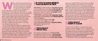
My contents will feature the same sans-serif font as my front cover. This is to keep withy laid back, easy-to-read theme. I would like to use different colours for the first part of my headlines to the descriptions to give you a clear separation between each headline. I will feature a subscription box in the bottom left hand corner with a contact number and some text in the same font about how to have your magazine delivered etc. The font used will be in upper case as that is the style of the font I have chosen to use. I would like to match my font with the one used on my font cover as I want my magazine to flow throughout each page. I woukld like to use a simple font like the example below for my contents page.


Double page spread:

The font on this page will be slightly different to the others in the sense that it will be in black and white, with possible some of the same green used on previous pages. This is because I intend to use a black and white image to give my double page spread a more dramatic feel. The font itself will again be in upper case as it is the same one used on my front cover and double page spread. My headline will be a different font as I would like to make it unique and interesting for the reader. I think the font will look good because my article is going to be small as that is what the people in my survey decided. A font like the one displayed below would give my DPS a creative different look to the rest of the magazine and will make my title stand out.


Magazine name options and DPS article headline options

Possible magazine names:

  • Coastal Running
  • Run Cornwall
  • Running Kernow
  • Cornish Runners
  • Cornish Coastal Runs
  • Run The Coast
I like these names because they all link to Cornwall in their own specific way.  Because my magazine is a regional running magazine, it needs to feature either something to do with running and also Cornwall.

Possible double page spread article headlines:
  • Chase your dreams
  • Elite talk chase
  • Thrill of the chase
  • Steeplechasing elite
  • Head to head in the chase
  • Making a splash
  • Seeking chase glory
My article is about steeplechase and the elite, therefore it needs to have a title linking with steeplechase and or elite athletes. I like all of these titles as they are unique and explain the article, giving audience appeal.


Magazine names and double page spread headline possibilities


Possible magazine names:

  • Coastal Running
  • Run Cornwall
  • Running Kernow
  • Cornish Runners
  • Cornish Coastal Runs
  • Run The Coast
I like these names because they all link to Cornwall in their own specific way.  Because my magazine is a regional running magazine, it needs to feature either something to do with running and also Cornwall.

Possible double page spread article headlines:
  • Chase your dreams
  • Elite talk chase
  • Thrill of the chase
  • Steeplechasing elite
  • Head to head in the chase
  • Making a splash
  • Seeking chase glory
My article is about steeplechase and the elite, therefore it needs to have a title linking with steeplechase and or elite athletes. I like all of these titles as they are unique and explain the article, giving audience appeal.


Tuesday, 18 October 2016

My magazine publisher


Orca Publications are the institution of many water sports magazines. For example, award winning, best seller Carve Suring magazine is very popular in the south west because there is such high interest in the sport. I like the style of magazine this institution creates and therefore I think I will use this institution to publish my magazine. I think a regional running magazine will give this institution a new feel with the mix of a new sport.

shot types and lighting for images


For my front cover image I will use a portrait wide shot of an athlete running on a track. I like this idea as it will help me set my colour palette. I will use natural lighting and edit my picture as needs be in Photoshop.


My contents page will feature a tilt shot to add something new to the magazine. I will use this time an image of an athlete in a Cornwall county vest to show the high level of the athletes featured in the magazine. Again I will use natural lighting and edit my image in Photoshop as needed.

My double page image will be of an athlete doing steeplechase as that is what my article is going to be about. I would like to get an image of an athlete going over the water jump as I think this will make a good image with the water everywhere. A wide shot will give the image a better feel and show the audience what is around the athlete. I will have this image in black and white to create a more dramatic effect. This will also make the article stand out among the others in the magazine. I will use natural lighting and change the f-stop on the camera to allow more light etc. I will also edit the image in Photoshop as needed.


When shooting live events, it may be very difficult and sometimes not possible to get the exact lighting I need for a particular image. This is because I am unable to ask an athlete to stop during a race, to pose for me to take the perfect picture. However, I will position myself in the best place for the duration of the race, where I am able to get the best natural lighting for the image. If i am unable to use natural lighting, I will find the best place to use a reflector, for that added light effect. In terms of shot types at live events, it can be difficult to get close to the athletes if they are on the track for example. In this case, I will have to make do and use the correct angles for where I am positioned. When athletes are running, it is difficult to get all of the images you need from one angle anyway. Therefore, moving about for the duration of a race, enables you to capture a variety of images from just the one race. If the race is a sprint (a short race, less than 400m), it is probably best to stay in one place in order get the best shot types required.

Cover story adn DPS article info

For my cover story I have decided I would like to feature a female athlete. I have decided on this because I would like to use a male athlete for my double page spread article. I would like to feature both male and female athletes in my magazine so that I am catering for both genders in my target audience. My cover story will feature a national female athlete. I think this will inspire people and show that Cornish athletes can succeed nationally. I think this will also intrigue people and make them want to read on and find out more about the athlete.

My double page spread article will be about how to steeplechase Like the elite. I will feature the best kit to achieve the best results and tactics to have the perfect race. I have decided to do an article on steeplechase because it is a hugely popular track event in Cornwall at the moment. With people reaching national and international level in this event I'd like others to become a part of the craze. My article will include comments from 2nd place English schools medalist Tess Masselink on how to have the perfect water jump and much more. I hope to inspire others to have a go at steeplechase, as it is normally an avoided event because it isn't as popular as 100m for example.

Initial idea development

My initial idea was to create a regional Cornish magazine with pictures and articles on thing to do and see in Cornwall. After doing some research I decided to do something I feel passionate about and am interested in myself. I also think there is a gap in the market for a regional running magazine. I decided to be more specific with my magazine as I think it could be something that a lot of people are interested in. My primary target audience is people aged 17-34 with sporting interest. Therefore I have tailored my initial ideas to fit the needs of my target audience. My survey asked questions from what kind of articles people would like to read to how many pictures they would like on a page.

Because I have such a wide age range from my primary target audience, I have developed my initial ideas to cater for this age group. My magazine will be mature and sophisticated yet include interesting feature tailored to the younger readers. I have chosen to have fewer, yet bolder colour for my colour palette as I feel this grabs the readers attention more instead of having a very simple and boring colour palette which would not attract my younger target audience.

I have chosen to use simple san-serif font for my main text and on my double page spread headline and my front cover masthead I will use an interesting serif font to draw the readers attention. I found when doing my research that this is a common code and convention of magazines and I feel that my target audience will be looking for this in a magazine.

Friday, 14 October 2016

Survey monkey responses

My target audience is mainly females so this result is as expected and will show the accurate results I need.

My primary target audience is people aged 17-34, this is the age of the majority of the people who took my survey. My secondary target audience is people aged 35-44 which is included in my survey results also. This means that my results will show an accurate result.

The majority of my audience chose to have a red, white and black colour palette. Yet I think I will choose my second opted option of green, black, white and burgundy. I have chosen to do this because  I think this will appeal more to my primary target audience as the colours are light connoting youth. Yet the burgundy gives the page a calming effect.

The majority of my audience chose Latest sportswear and accessory updates/recommendations. I think this would be a good article to read and agree with my audience on this choice. I also like the idea of a healthy eating plan article.

I think I will have one main image for my contents page and possibly 2 minor images. I agree with my audience on 2-3/4-5 images.

I think I will include one main image and a minor image for my magazine because I feel it will give the magazine a different look. Yet it will go against common codes and conventions.

I think I will write a small article for my magazine and feature a main image attracting the readers attention.

I will price my magazine at £2.50 as this is what the majority of people have chosen. I think this is a good deal for a regional magazine.


From this information I now know that I am getting accurate results from this survey as more than half of the people who took the survey either run or are interested in running.
This shows that my magazine is a good idea and most people would by the magazine I am going to produce.

Friday, 7 October 2016

Typography

Front cover:

Masthead:
  • Bold
  • Larger than all other fonts on page
  • Usually sans-serif font
  • sometimes underlined
Coverlines:
  • Smaller than masthead
  • A mix of serif and sans-serif fonts
  • Italics for important information
  • Can be in bright colours to draw readers attention
  • Normally only 1-2 sentences long.
Puffs/Pugs:
  • Bright and colourful
  • Usually circular in shape
  • Can be edited to draw readers attention
  • Usually a competition advert
Small print:
  • Typically sans-serif font
  • located in corners of pages or near barcode
  • sometimes in italics
  • Usually in black or white font
Contents:

Heading:
  • Typically sand-serif font
  • Bold font
  • very simple
  • located at the top of the page
  • normally in a colour matching the colour palette or black/white
  • usually in upper case
Subheadings:
  • Typically in italics
  • sentence case
  • usually in a different colour to highlight them and catch the readers eye
  • smaller than the heading
  • located in different places around the page
Small print:
  • Located in corners of pages
  • Typically sand serif font
  • usually in small italics
  • usually in sentence case
Double page spread:

Heading:
  • Usually in sans-serif font
  • sometimes in colour to draw attention
  • largest text on page
  • Can be designed to look like something from the article or a quirky shape/layout
Subheading:
  • Slightly smaller than heading
  • usually in italics
  • coloured draw attention
  • typically in sentence case
Byline:
  • Typically in bold
  • Italic font
  • Coloured to draw attention
  • Located near subheading or within subheading
  • Typically upper case
Pull quotes:
  • Bold
  • Italic writing
  • Usually underlined
  • Slightly larger font than article
  • In quotation marks
  • Usually a different colour used for the font
Article copy:
  • Smaller font than heading and sub heading
  • Usually in black or white font
  • Sentence case
  • Sans-serif font
  • In column rows down page
Small print:
  • Sans-serif font
  • Typically white or black font
  • Located in corners of pages
  • Sentence case

Tuesday, 4 October 2016

Genre conventions

Front cover:


Layout:
  • One main image.
  • Masthead at the top of the page.
  • 4-6 coverlines in various places around the page.
  • A barcode at the bottom of the page along with price and date/issue number.
Colour:
  • One main colour palette to stick with throughout the magazine. This will consist of 4 colours, usually black white and 2 main feature colours.
  • Yellows and reds are popular to grab the readers attention.
  • I will use a contrast of dark and light colours.
House style:
  • For my magazine I will keep the same masthead so that my audience know how to find my magazine.
  • I will keep the same layout for all front covers where possible.
  • My masthead will always be either black or white.
Typography:
  • I will use sans-serif font for my masthead and most of my page.
  • Some cover lines/ specific words will be in italics to highlight key points.
  • I wont use much text on the front cover.
Images:
  • I will have one main image for my front cover.
Representation:
  • I want my magazine to be represented as a high end regional magazine people should be able to see this from my front cover.
  • The magazine will look simple yet informative.
  • An interesting, yet easy read.
General content:
  • My front cover will contain coverlines with examples of what's inside
  • one main image
  • barcode
  • price
  • issue number and date
  • masthead
Contents page:

Layout:
  • For my contents page I am going to go against conventions and use only one image.
  • I will use 10-15 headline titles down the left hand side of the page.
  • I will have a subscription box at the bottom of the page with future magazine examples and contact details.
  • I will have 'contents' as the page title.
Colour:
  • I will follow the colour palette from my front cover to  keep with a house style.
  • I wont use any new colours because this would go against conventions and not fit with my colour palette.
House style:
  • My contents page will always be laid out the same to keep a house style that readers will recognise.
  • I will try to keep the same colour scheme, if not similar.
  • I will always have one main image
  • Each issue will have a subscription box.
Typography:
  • I will use a sans-serif font for all of the text on the page, just as I did for my front cover.
  • Important text may be highlighted in italics as this follows common conventions.
  • I will have headline titles down one side of the page.
  • The page title will be 'contents'
  • Text will be to a minimum so that it is easy for the reader to find what they are looking for.
Images:
  • I am going to go against general conventions and have one main image for my page.
  • It will be a front facing image.
Representation:
  • I want my magazine to be represented as laid back and easy to read.
  • For this reason my magazine will not be busy and full of info.
  • My magazine will be high end yet laid back.
General content:
  • My contents page will contain one main image
  • 10-15 headline titles
  • Main page title
  • 4 main colours
  • subscription box
  • contact details
Double page spread:

Layout:
  • One main image across pages, possibly one minor image
  • heading left hand side
  • subheading under heading
  • article across both pages
  • page numbers bottom right and left hand corners
  • date and issue number in top right hand corner
Colour:
  • I will keep the same colour palette as my front cover and contents page.
House style:
  • I will use the same fonts and colours to keep my house style.
  • My layout will be follow common codes and conventions.
Typography:
  • I may use a different font for my title. I will create my own font.
  • My article font will be the same as my contents page text.
  • I will have my font the same colour as my contents page text.
Images:
  • I will use 1 main image and possibly a minor image. This goes against conventions as double page spreads usually contain 2-5 images.
Representation:
  • My double page spread will represent local athletes in a good light.
  • My page will be simple yet informative.
  • I will keep my house style throughout.
General content:
  • One-two main images.
  • One double page spread article.
  • Article title.
  • Subheading.
  • page numbers.
  • issue number.

Wednesday, 28 September 2016

Audience profiling

Primary audience:

Audience profiling allows media businesses to narrow down their audience/customers to find their target audience. It is always best for a media businesses to find their target audience before marketing a new product so you can get the best results and profit well. A target audience is one that is most relevant and connected to a media product that a company is trying to see, hence the name target audience.

Audiences are graded using a chart similar to the one below:


My primary target audience will be people of a social grades B-C1 aged 17-34. I have chosen fairly high social grades because my magazine is unique and being a regional magazine of such a specific topic, it has a very niche target audience. my audience nationality will be British and the magazine will be aimed mainly at people in the south westerly area. The ethnicity is mainly white British and people of any sexuality e.g gay/straight/bi. It will be aimed at men and women of medium income. My target audience will be people earning money and/or in higher education, my primary target audience will be healthy active people or those who want to be healthy and active! They will have high ambitions for life and want a healthy active life style.

Secondary audience:
Age:35-44
Nationality: British
Living Location: West region
Ethnicity: White British
Sexuality: Straight

Social Grade: C2
Income: Medium- high/ high
Gender: Female  

My secondary taget audience includes people of social grade C2 they will have interest of people and sport in the regional area of the southwest. This slightly older audience will be more established in their lives and know what they are doing. They will find excitement in my magazine as it will be different to what they read in their normal routine.

Audience appeal:


The Uses and Gratifications Theory (Blumler and Katz 1975), suggests there are certain reasons why an audience responds to different media texts. Uses and gratifications theory is an approach to understanding why and how people actively seek out specific media to satisfy specific needs.


The psychographic of my audience:
Psychographic segmentation involves dividing your market into segments based upon different personality traits, values, attitudes, interests, and lifestyles of consumers. This segmentation is advantageous because it allows you to engage in product design and marketing in a focused manner.

Young and Rubicam:


Primary target audience:

  • The explorer
  • The succeeder
Secondary target audience:
  • The aspirer
  • The mainstream


Maslows hierarchy of needs:


Maslow's hierarchy of needs is a theory in psychology proposed by Abraham Maslow in his 1943 paper "A Theory of Human Motivation" in Psychological Review. Maslow subsequently extended the idea to include his observations of humans' innate curiosity.

Primary target audience: My magazine will trigger self-actualisation of my readers and make them want to take part in running and try something new and feel you are living to your highest potential. Also safety and belonging if they live in the area.

Secondary target audience:
My magazine will cater for this audiences esteem needs rather than needs that are already being met as I feel this audience will already know where thirty are I'm life and are settled.

Vals theory:

VALS ("Values and Lifestyles") is a proprietary research methodology used for psychographic market segmentation. Market segmentation is designed to guide companies in tailoring their products and services in order to appeal to the people most likely to purchase them.


primary target audience:

  • innovators
  • esteem seekers
  • strivers
Secondary target audience:
  • traditionalists
  • strivers