Masthead:
Coverlines:

- Smaller than masthead
- A mix of serif and sans-serif fonts
- Italics for important information
- Can be in bright colours to draw readers attention
- Normally only 1-2 sentences long.
- Bright and colourful
- Usually circular in shape
- Can be edited to draw readers attention
- Usually a competition advert
Small print:
- Typically sans-serif font
- located in corners of pages or near barcode
- sometimes in italics
- Usually in black or white font
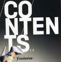
Contents:
Heading:
- Typically sand-serif font
- Bold font
- very simple
- located at the top of the page
- normally in a colour matching the colour palette or black/white
- usually in upper case

Subheadings:
- Typically in italics
- sentence case
- usually in a different colour to highlight them and catch the readers eye
- smaller than the heading
- located in different places around the page
Small print:
- Located in corners of pages
- Typically sand serif font
- usually in small italics
- usually in sentence case
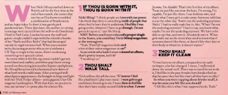
Double page spread:
- Usually in sans-serif font
- sometimes in colour to draw attention
- largest text on page
- Can be designed to look like something from the article or a quirky shape/layout
Subheading:

- Slightly smaller than heading
- usually in italics
- coloured draw attention
- typically in sentence case
Byline:
- Typically in bold
- Italic font
- Coloured to draw attention
- Located near subheading or within subheading
- Typically upper case
Pull quotes:
- Bold
- Italic writing
- Usually underlined
- Slightly larger font than article
- In quotation marks
- Usually a different colour used for the font

Article copy:
- Smaller font than heading and sub heading
- Usually in black or white font
- Sentence case
- Sans-serif font
- In column rows down page

Small print:
- Sans-serif font
- Typically white or black font
- Located in corners of pages
- Sentence case


A detailed and thorough analysis
ReplyDelete