Wednesday, 28 September 2016

Audience profiling

Primary audience:

Audience profiling allows media businesses to narrow down their audience/customers to find their target audience. It is always best for a media businesses to find their target audience before marketing a new product so you can get the best results and profit well. A target audience is one that is most relevant and connected to a media product that a company is trying to see, hence the name target audience.

Audiences are graded using a chart similar to the one below:


My primary target audience will be people of a social grades B-C1 aged 17-34. I have chosen fairly high social grades because my magazine is unique and being a regional magazine of such a specific topic, it has a very niche target audience. my audience nationality will be British and the magazine will be aimed mainly at people in the south westerly area. The ethnicity is mainly white British and people of any sexuality e.g gay/straight/bi. It will be aimed at men and women of medium income. My target audience will be people earning money and/or in higher education, my primary target audience will be healthy active people or those who want to be healthy and active! They will have high ambitions for life and want a healthy active life style.

Secondary audience:
Age:35-44
Nationality: British
Living Location: West region
Ethnicity: White British
Sexuality: Straight

Social Grade: C2
Income: Medium- high/ high
Gender: Female  

My secondary taget audience includes people of social grade C2 they will have interest of people and sport in the regional area of the southwest. This slightly older audience will be more established in their lives and know what they are doing. They will find excitement in my magazine as it will be different to what they read in their normal routine.

Audience appeal:


The Uses and Gratifications Theory (Blumler and Katz 1975), suggests there are certain reasons why an audience responds to different media texts. Uses and gratifications theory is an approach to understanding why and how people actively seek out specific media to satisfy specific needs.


The psychographic of my audience:
Psychographic segmentation involves dividing your market into segments based upon different personality traits, values, attitudes, interests, and lifestyles of consumers. This segmentation is advantageous because it allows you to engage in product design and marketing in a focused manner.

Young and Rubicam:


Primary target audience:

  • The explorer
  • The succeeder
Secondary target audience:
  • The aspirer
  • The mainstream


Maslows hierarchy of needs:


Maslow's hierarchy of needs is a theory in psychology proposed by Abraham Maslow in his 1943 paper "A Theory of Human Motivation" in Psychological Review. Maslow subsequently extended the idea to include his observations of humans' innate curiosity.

Primary target audience: My magazine will trigger self-actualisation of my readers and make them want to take part in running and try something new and feel you are living to your highest potential. Also safety and belonging if they live in the area.

Secondary target audience:
My magazine will cater for this audiences esteem needs rather than needs that are already being met as I feel this audience will already know where thirty are I'm life and are settled.

Vals theory:

VALS ("Values and Lifestyles") is a proprietary research methodology used for psychographic market segmentation. Market segmentation is designed to guide companies in tailoring their products and services in order to appeal to the people most likely to purchase them.


primary target audience:

  • innovators
  • esteem seekers
  • strivers
Secondary target audience:
  • traditionalists
  • strivers


Wednesday, 21 September 2016

Analysis of similar products- Front covers

In this post I will be analysing existing regional magazines. 3 front covers, 3 contents pages and 3 double page spreads. I will be doing this in order to discover the codes and conventions used and what I should include in my regional magazine. I will be analysing 2 cornish regional magazines and one UK based running magazine. I will do this as I am going to be basing my magazine on a running magazine. I will take ideas from these magazines in order to decided what features to include within my magazine.


Front covers.
Cornwall Today:

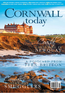
Cornwall today is a regional magazine from Cornwall as you might have guessed. It focuses on Cornwall Today is an award-winning sophisticated magazine based in the heart of Cornwall. It prides itself on its combination of amazing photography and inspiring editorial. Named Best Regional Magazine in the 2014 Newspaper Awards, with it's website shortlisted for Best Digital Innovation, Cornwall Today is the biggest and best-selling monthly magazine for Cornwall. It has fascinating features and stunning photographs covering walks, wildlife, art, food, leisure, wellbeing, homes, gardens and much more.

In terms of colour, they have chosen a lavender and white scheme. I feel this gives the magazine a slightly gloomy look. The sea is a dark grey colour and not a lovely bright blue. I feel this gives off connotations of coldness and fear possibly. The masthead matches the colour of the sea keeping with the gloomy colour palette. I feel that the masthead stands out nicely against the pale lavender giving  the magazine a bold look and grabbing the readers attention. The mast head is in a serif font separating it from the coverlines and making it stand out more. This is a common convention for Cornwall Today magazine.

The typography of this cover is very simple and easy reading for the audience. I like how the fonts are are very plain and the only thing that makes the words stand out is when they are put in bold or italics. It is sophisticated. Because of this I think that this magazine is aimed at an older target audience aged 30-60 social grade A-C1. The magazines follows common codes and conventions by having important information within the coverlines in bold. This enables the reader to  know key facts of the articles inside.

I think that this magazine is not suited for just any target audience. I think that the feature inside and image on the front would not appeal to a 16 year old for example. Think it would suit the older generation aged 30 and up as they may be more interested in the type of articles this magazine has within. The magazine is priced at £3.95 which I feel is fairly expensive for a regional magazine. The reason for this may be because of the quality of the magazine, information inside and the higher class that the magazine is aimed at. People of social grades A-C1.

Cornwall Life:

Cornwall Life is another Regional cornish magazine. It features the stunning places in Cornwall you can visit and the amazing locals, what they have been up to and what they do in their county. Inside you will find amazing days out and yummy restaurants to visit with the family.

The colour palette of this magazine incorporates the colours of the beach making it look simple yet effective. The masthead is separate from the image on a crisp white background making it instantly grab your attention. The layout seems to go from light to dark and back to the light colours of the sand at the bottom of the page. I feel this goes against common codes and conventions but it gives the magazine a unique feel.

The typography of this magazine is very classy. I like the serif advert in the bottom left hand corner, I think this is a good way to attract readers eye. I feel that this will attract a different type of audience. Possibly of a higher class. I like the way the competition advert stand out, however I do feel that is slightly distracts from the other coverlines too much. Although it is a very unique and eye-catching design, which I think is the idea as it is a competition.

The magazine is priced at £3.45 which I think is a reasonable price and not too expensive but just slightly more than your average magazine. I think it is higher priced because it is a regional magazine and unique. It is also aimed at people of higher class social grades A-C1. The magazine focuses on closely knit communities in Cornwall and the way Cornish life flows. Many people are interested in Cornwall and i feel that this is why the magazine sells well.

Runners World:

Runners world is not a regional magazine, but it is based in the UK. I have chosen to look at this magazine because I like it's house style. The magazine is priced at £4.50. I think this is a reasonable price for the magazine itself as it has a variety of content. The audience for this magazine are people aged 16 -40 with a running interest. I think that because of the price it is suited to people with a social grade A-C1.

The colour palette of this magazine fits with the style of athletics. With the main colour being the classic track red. They have combined this colour to match the runners shorts making what could have been a clash a classy match. The house style conforms to common codes and conventions as there is nothing unusual about the layout and style of the page. The colours of the page are somewhat pastel. Yet the boldness of the yellow coverlines catch your eye instantly.

The typography used is a mix of serif and san serif. This gives the magazine a unique yet not unusual look. This fits with common codes and conventions because this is not an unusual thing for magazines to do. The main cover line is in a very large san serif font which is unusual as it is almost the same size as the masthead distracting you from the magazine name. This may be in order to draw the readers attention to the story rather than the magazine name which they should already know.


Analysis of front covers:


The two regional Cornish magazines are similar in terms of images as they both have an image with the sea in. I like the style of these two magazines, however I prefer Cornwall Life magazine as it seems more colourful and a more inviting magazine. Runner’s world is a classic running magazine and follows all common codes and conventions except one. The main image is not front facing. It is side on. Although it goes against common codes and conventions I like this style and I think it will be something I look at doing for my regional magazine. Cornwall today features a crisp, sharp focused picture of a man by the sea with his dog. I like this image because it seems like a strong image and would stand out to a reader. Cornwall life is bright, cheerful, yet less informative than Cornwall today. I like the layout and typography of the page as it is very eye-catching. This could have an advantage over ‘Cornwall today’ on a magazine shop shelf. Cornwall life have stuck with the same blue throughout the page which keeps the page looking fresh. The competition advert at the bottom of the page gives it a splash of colour and makes the page look a bit more interesting.


Runners world sticks to a colour palette of the classics ‘track red’ and a pastel pink. Key points are highlighted/ written in yellow. The colour Yellow has connotations of happiness and alert. The yellow draws the reader’s attention. I think I will use yellow in my colour palette for my magazine front cover. This magazine features many facts and figures. For example ’50 best exercise moves for runners’ ’21 healing super foods’ ‘up your stamina by 12% in one week’. This is the difference between the regional magazines and the running magazine. The running magazine is informative and to the point. It is to inform runners on new things and the fastest way to get better at what they do. Whereas the regional magazine is to invite people to Cornwall and show them what’s on offer while you are visiting or why you should move here etc.


For my magazine, I need to combine all aspects of regional and running magazines to create a ‘regional running’ magazine. In order to do this I need to take different things into consideration and choose what features I will take from each style of magazine. I like the layout of runner’s world magazine and I also like the layout of Cornwall life magazine. I think if I combine the two magazine layout ideas and make them my own I could create a rather exciting and eye catching magazine front cover. I have learnt through looking at magazine front covers, is that sometimes it is good to go against the common codes and conventions of typical magazines to create something unique that a business would be interested in buying. This could be done in terms of change of image, change of font, or change of layout etc.


Tuesday, 20 September 2016

Analysis of similar products- Contents page

Image result for cornwall today contents page 


Cornwall Today:


Cornwall today have chosen a scenic sunset picture for the background of their contents page. The layout is simple yet effective. I feel that the magazine is setting an example of the true beauty of Cornwall with the display of this main image. The Purple combines the calm stability of blue and the fierce energy of red. The color purple is often associated with royalty, nobility, luxury, power, and ambition. This gives you a feel for the county. The text is kept simple as to not distract from the image in the background, but yet to still give information to the reader.


The typography of the text itself is in a simple san serif font. This font is used throughout the page to keep with the house style. The only things written in serif is the month map title. This is as to not distract the reader from the background again.


The magazine has kept with a sea theme as the front cover features and man and his dog stood by the water. Cornwall is well know for its beaches and coastal walks. This may be why it feature the sea a lot. The background image is of a good quality an on matte paper. I think this gives the picture a better look.


The text is over two pages which doesn't follow common codes and conventions as contents pages are normally only one page. I feel the reason why this contents page is over two pages is because it gives a better perspective of the background image.


Cornwall Life:
Image result for cornwall life magazine contents pageAgain this regional magazine has used a coastal image as their main image and another for their minor image. This again shows that Cornwall has connotations of a beach/surf lifestyle. People who read these regional magazines about Cornwall want to know what it is all about and the places you can go. The audience for this magazine tend to be people who don't live in Cornwall or people who are looking for something to do in Cornwall.

In terms of typography the font is a simple san serif again to not distract too much from the images. The text is simple and informative. The colour palette is kept very neutral with black and beige being the only two colours really used. This contents page has less information than Cornwall today yet it has two images which conforms amore to common codes and conventions of a magazine contents page.

The image quality isn't quite as good as Cornwall today yet there are two pictures. The images are on matte paper again making the magazine look less expensive and of a lower quality. The colour palette is kept to blues and greens along with the sandy beige for some of the text, keeping with the beach style theme.

Runners world:

Image result for runner's world contents pageThis runners world contents page fits with common codes and conventions as it is over one page. The amount of images is somewhat less than usual for a normal contents page because there is only one. This magazine includes a plain image. I would not use something like this for my contents page as I feel it is boring and unattractive to the reader.

In terms of colour palette the only colour featured apart from the colours of the background in the image is the red from the man's top. the page itself is very dull and boring. The image quality isn't very good, I think this may be as it is an older magazine issue. The image is on matte paper, this reflects the cheap magazine price. The magazine is prices at £4.50. For such a specific magazine, this is a cheap price. The text is highlighted with bold and a light blue colour in certain areas to show important information.

Analysis of contents pages:

Cornwall today has a large background image as its main feature. It is of a sunset in Cornwall and has been slightly edited to make its main colour purple. This sets the colour palette for the page. This contents page goes against common codes and conventions of a contents page as it is across two pages. The image used in this contents page is only slightly different to that of Cornwall life magazine, which also features a sea image. Because of its large background image, and the fact it is spread across two pages, Cornwall today features the most information of the two regional magazines. Again, the colours of ‘Cornwall today’ magazine are very dark and fit with the colour scheme set on the front cover. This leads us to think that this will be the colour palette throughout the magazine. In terms of the contents page colour for Cornwall life, we are seeing it follow the same codes and conventions of Cornwall today magazine. It has kept its bright colours and writing to a minimal. I think this makes the page easier to find information for the reader.

Runner’s world has kept its page simple and factual yet again. It is key for the reader to be able to find exactly what they are looking for. In terms of colour palette the page uses a white background with black and pale blue text. The only real colour used is blue. We saw this used on the front cover. blue connotes sadness and cold. This is very different from the front cover which featured that warm 'track red' colour. I like how simple the layout of the page is. It follows the common codes and conventions for a contents page of this magazine style. However it is very boring and I would not have something like this personally for my contents page.

Cornwall life and runners world are the only two contents pages here that really stick to common codes and conventions completely. It features more than one image and has minimal but informative text that relates to the magazine style. Runners world however has one image. I like these contents pages, but I feel they are somewhat boring and would not take ideas from them for my magazine.

For my magazine I think I will stick to the idea of Cornwall today and runner’s world and have one image. This somewhat goes against common codes and conventions but in some way I feel this suits the style of magazine I am going for. I like the idea of using yellow to highlight text. I feel this does grab the reader’s attention and would draw them in to read the magazine. However this is not as important for the contents page as it is inside the magazine. I think that my contents information will be straight to the point and informative like runner’s world magazine. I would like to keep my colour palette the same throughout my magazine and stick to the colour I decide on for my front colour. I hope to feature a shade of yellow and hopefully neutralise it with white and possibly pastel colours. The typography of my magazine will match my front cover. I think I will stick with common codes and conventions and use a simple san serif font.


Thursday, 15 September 2016

Analysis of similar products- Double page spread

Cornwall today:


Image result for cornwall today magazine double page spreadThis Cornwall today double page spread is in-keeping with the front cover and contents we have seen before. It features a moody colour palette, yet again. The image itself is very dark and only highlighted by the food, which is the main focus of the image. The text is written in white making out stand out on the darker background. I feel that the layout of this double page spread isn't as clear as it could be. There are three separate images. The image on the left and the main image on the right almost overlap themselves which may confuse the reader. However the use of colour is good and the masthead is clear and interesting.

In terms of typography, there is plenty of information included but not too much as to bore the reader. The main text is in a simple san serif font. The masthead has an image for the 'A' in 'boatshed'. this is interesting and draws attention. There is a logo on the right page next to the minor image. This is so the reader can recognise the restaurant name.

This double page spread goes  slightly against common codes and conventions as the image layout is a bit different.

Cornwall Life:
Image result for cornwall life double page spreadCornwall life magazine have kept with their laid back light colour scheme with blues and yellows to highlight the page. It includes one main image and four minor images. The main image shows a lovely woodland scenery, very typical for a Cornwall. Although some of the pictures are dark they have lightened the page up with a white background and some light green text in areas.

The layout of the page is simple yet gives all of the details you need the images do a lot of the telling for you and also grab the readers attention. The layout stick with common codes and conventions, but has little text which leads me to think it may continue onto another page.

The typography itself is simple and there are no fancy fonts for the masthead, just italics for the subtitle. I like the overall style and layout of this page however I think I will add more colour to my double page spread and use less images.


Runners world:
Image result for runner's world articleThis runners world double page spread is very colourful and combines the aspect of mind and sport together, creating some interesting cartoons for the images of the page. The colours used match those of the front cover with the warm track red, but includes some new colours such as cool blue and pale yellow. all of these colours have different connotations. All of which relate to sport. The cool blue representing the sad and harsh times in sport, the track red representing heat and frustration and the yellow connoting happiness and success.

The layout is clear and you are able to understand the flow of the page. The colours from the images are carried on within the layout and text boarders. The typography is simple yet effective with bold fronts for the title and subtitles. Some important information is highlighted in either red or blue to make it stand out. I like this layout and I think I will take some ideas when I come to do my double page spread.


Double page spread analysis:

From my double page spread analysis I can see that each one is laid out in a very different way and each has a unique style of it’s own. In this case, Cornwall today and Cornwall life are very different. Their layout and choice of images do not feature anything of the same sort. Cornwall today have stuck, yet again to dark colours and has an article on a Cornish restaurant called ‘The pavilion Boatshed restaurant. Cornwall life features on beach image and the rest are very warm and inviting pictures of places in Cornwall. Runners world keep it simple yet interesting with cartoon drawn images and bright colours that draw the readers attention. The layout of Cornwall life and Cornwall today follow common codes and conventions of a double page spread, however Cornwall today is laid out slightly different with all it’s images at the top which isn’t normally seen in a double page spread but it works well for this particular set of pages.

 Of all of the pages I have studied for this analysis I like runners world magazine best for it’s double page spread. I have come to this decision because I like its colour palette and layout. However I think I will stick to less images and defy common codes and conventions like Cornwall today has done with their double page spread. The titles of Cornwall today and Cornwall life are perfect size to fit with the text and easy for the reader to spot. However runner’s world has chosen to use a fairly small font for its title, which may be difficult to work out.


For my double page spread I think I will have one main image and possibly only one minor image. I like to have just one main image as to not distract the reader from the text too much, I feel the writing is the most important section of the pages. The text is what gives you the information. The image is also a key part of the page, which is why I think there should be one image to reflect the text. Unlike runners world I will use actual images of Cornish athletes, as my magazine is regional. I think it will be an action shot. I like the idea of an athlete running on a coastal path to fit with the regional aspect of the brief as well as the athlete being Cornish. I will keep with my colour scheme from my contents page and front cover and carry this on to my double page spread. In terms of typography I think I will use a mix of serif, san serif and italics to create a bold look. Cornwall today have done this with their title and I think it create a quirky unique look. The italic look is used in Cornwall life’s magazine in the last word of their title followed by ellipsis. Runner’s world’s title is very plain which I don’t like personally. Overall I like Runners world magazine best but will take aspects from all magazines to create my own.

Friday, 9 September 2016

Initial thoughts and ideas

 My initial idea is to make a regional running magazine, aimed at people aged 16 upwards. I have chosen this because running is something I am very interested in and like to read about. I know that it is also something a lot of people in Cornwall are interested in because of our amazing countryside and endless trails to run on. I think it could be a really good idea and work well in our regional area as I feel there is a gap in the market.


I like the style of Runners world magazine. I think I will use a magazine like this to take ideas from when I create my own. However, because my magazine is regional, I would like to take ideas from a regional magazine in my area. For example Cornwall today. If I could incorporate running with the scenery of Cornwall I think that could be a really great idea.
Image result for cornwall today
 Image result for runners world
I think the content of the magazine should be simple, factual and to the point. Runners like to know facts. Things that will aid them in their performances and new kit to help them along the way. The image below is a key example of what I would like to do. Simple, yet effective, this cover shows facts and style. With a simple colour scheme matching the scenery and the athlete.

Image result for running magazine

The impact of technical advances on regional magazines.

Over the past 10 years technology has become more and more advanced. With things like online versions and subscriptions, magazines have had to up their game and create these online experiences like the big magazines, to widen their popularity to cater for all audiences. However, these movements are proving fatal for some small and regional magazines. Those unable to afford, or create online versions of their magazines face a loss in the market. With more and more people checking the news and reading articles online, big and small magazine companies are seeing a fall in shop sales.


With the younger generation (ages 14-18) being raised around technology and everything on tablets and phones, they are less likely to go in to a shop and buy a magazines just as the older generation would. This connotes that the future of material magazines is dwindling. Before we know it, buying material magazines will be a thing of the past. Of course this will have an impact on magazines sales.


Advances in computer technology also mean that producing magazines is a much quicker process than it has been in the past. Magazines can be sent via email, and printed wirelessly by machines within minutes. This also means that mass amounts of magazines can be done quickly and effectively. However this does cost money. Which needs to be taken into consideration.


In terms of exhibition, my magazine will be advertised online, in newspapers, on leaflets and on posters in stores. The idea is to place leaflets in areas which the magazines appeals to people. For example sports centres, athletics tracks, gyms etc. Although my magazine is a regional magazine, online exhibition will give it a wider spread audience, with people all over the country looking and becoming interested in running in our region. 


Consumption of magazines: In addition to the 25% drop in print-newspaper consumption, magazine readership has fallen by 19% in the same four-year period. Although traditional television use has also fallen, it has declined by a much smaller amount—only 6% since 2010. ZenithOptimedia says that it expects consumption of print newspapers will continue to drop by almost 5% per year over the next several years, and magazines almost as much.


Institutional research and legal restraints.

Bauer media is a large company in charge of many different types of magazines from fashion to sport. Because my chosen genre of magazine is sport here are a few sport magazines produced by Bauer. 


Golf world, Match and Today golfer are all part of the Bauer media institute.


Rodale is a magazine publisher which publishes many sport magazines and many running magazines. It is the publisher of Men's Health, Prevention, Women's Health, Runner's World, Running Times, Bicycling, and Rodale's Organic LifeRodale Inc. is the global voice of health and wellness, providing actionable, authoritative, and engaging content.


In terms of UK based magazines publishers, Wireless group plc, formerly U TV Media plc  is a broadcasting and new media company based in Belfast, in Northern Ireland. It is a constituent of the FTSE SmallCap Index. It produces magazines such as:Sport.


For my magazine,as it is regional I will be aiming for a regional publisher. A publisher such as DC Media, who are based in Truro, Cornwall. I think they will be a good publisher for my magazines as they publish popular magazines such as Cornwall today.


Regarding the regulatory body regulating my area, IPSO is the one in charge.


Legal restraints When it comes to publishing a magazine, there are many legal constraints which the company must abide by and take into account, especially magazines that focus people and gossip. The reason being is that it is very easy to represent a person or group of people in the wrong way within the magazine and what the editors write, with that said, there are rules and legal constraints that are set out on what magazines can publish and what they cant publish. The people who decide upon what can and cannot be published is a company called 'Press Complaints Commission' (PCC) and also 'Advertisement Standards Agency' (ASA) who are both based in the UK and are the regulating bodies for publishing and advertising.There are many laws under the Human Rights Act 1998 which prohibit bodies from defamation, trespassing, nuisance, surveillance and harassment and if breached are able to take legal action which includes suing the company from damages to get compensation. When it come to photos and images you have to be very careful on what photos are taken, especially common photos of celebrities on the beach where they are half dressed  and young children etc. If I have an older target audience, the photos I use, will have to appropriate for target audience age I am aiming the magazine at.